01 — The client
The company
A financial company in Germany and a returning client: I had already built its website with a property catalogue and a partner network. In 2026 the company launched a new line of business, precious metals investments, plus a pay-with-gold programme for businesses.
02 — Context
The task
The new service needed its own landing page inside the existing site: built from scratch, in the brand’s style, on a single page. It has to sell the service before the first call: explain what a precious-metals deposit is, settle the questions about storage and trust, and lead to a free consultation.
There are two audiences: private investors who want to protect their capital, and business owners who are offered to accept payment in gold. Each gets its own block and its own call to action.

03 — Solution
How it works
3.1
Numbers above the fold
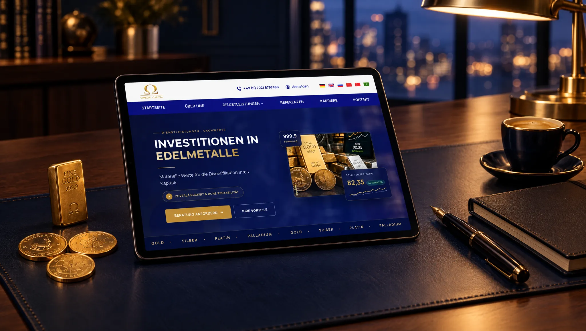
A headline, one sentence on the essence and two buttons: “request a consultation” and “your benefits”. Next to them, live numbers: 999.9 fineness, four metals, storage in three regions, 100 % buyer ownership. Numbers work better than promises.


3.2
Arguments in order
Eight reasons to open a deposit, then four steps from the first conversation to ongoing optimisation. The reader sees the whole path and knows what will be asked of them.


3.3
The complex made simple
The gold-silver-ratio strategy, rebalancing between gold and silver by rules rather than mood, is presented in one block with a picture and three points. Security gets its own section: vaults in three regions, insurance, a personal advisor.


3.4
An offer for businesses
A separate screen for business owners: new customers from the community, a Swiss account, cash and cashless payment, the SGApp with a partner map. Its own button, “enquire as a company”.

3.5
Legal requirements built in
Finance obliges: under the numbers sits a disclaimer that this is not investment advice and returns are not guaranteed. Every generated image carries a “KI-generiert” badge and a mark inside the file, as the EU AI Act requires.

3.6
Final version after the client’s revisions
The client asked for the page to sit closer to the rest of the site: a light background, three service columns, an SGApp block. That is how it went live. The dark version above remains as the design proposal, and both are built from the same copy and images.

04 — Outcome
The result
The new service got its own page without breaking the existing site. The page leads two different readers to two different actions: the private investor to a free consultation, the business to a partnership.